Design Post Mortem
How to adapt on mobile and tablet a Hack’n Slash monument that affected a whole generation of PC players? I just arrived at Dotemu and this was THE question I had to answer. More than a question, it was a challenge. It took almost 20 months of reflections, iterations and development in order to reboot this amazing title for its army of fans!
Everything needed to be (re)built but we were incredibly motivated. That is probably why we did it despite the difficulties we had to overcome and the concessions we had to make. I was convinced that this title would be a great mobile game and it deserved its place on those devices.
The task was tricky because I couldn’t alter the original game and yet a lot of elements needed to evolve to be playable …
UX: simplify the controls, straight to the point
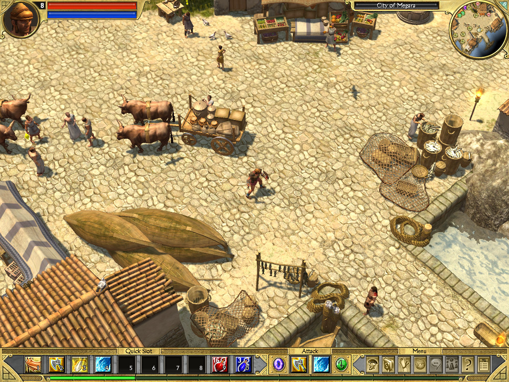 |  |
When you are playing a Hack’n Slash, whichever it is, you expect to see a lot of elements around the game window: spells, potions, weapons, pets … In a word, all the real fun that provides this kind of game.
The fact is that all over the journey, each new button has a well defined role in the adventure. However, the complexity is that each player can custom his buttons deck depending of the character’s class and his evolution.
It’s simple on a PC, there’s a mouse to move the character and a keyboard full of keys to assign actions. On a touch screen, you only use your fingers! And to be comfortable, you usually use your mobile this way:
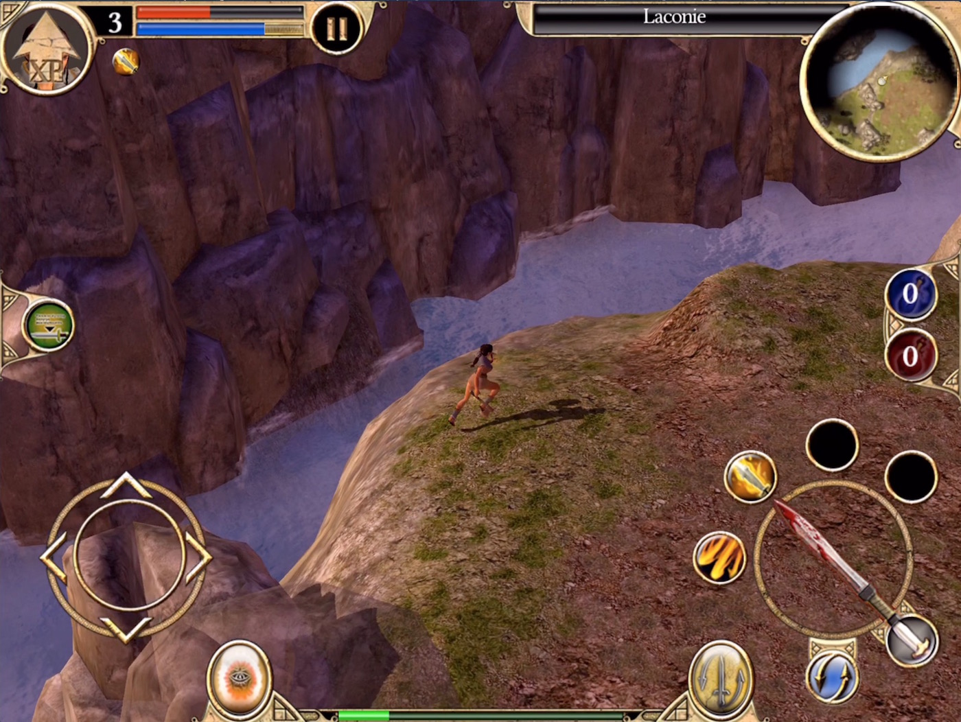
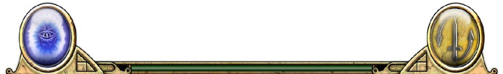
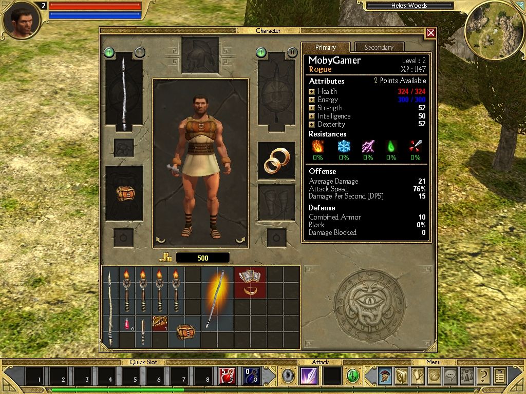
The area of the screen where the main action buttons can be grouped is located on the lower half section of the screen. The upper section contains game information: the life and mana bars, the character’s portrait, the map and the pause button.
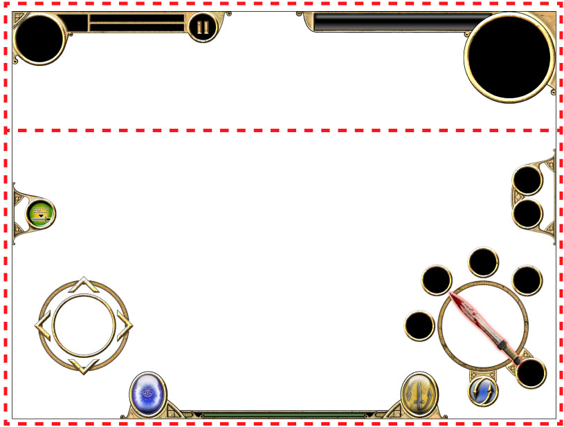
| A click to move the character is no longer a valid option on a touch screen for this kind of game. The action can’t be hidden by the fingers of the player. The thumbs are constantly glued to the screen and allow you to move the playable character and trigger actions. The virtual stick is well know by players and has already proven itself on many titles we’ve worn, and doesn’t require a wide area. The HUD must be thin enough and not disturbing for visibility. |  |
In Titan Quest, the frequently used buttons are the spells, the life and mana potions, the teleportation portal and the weapons switch. So I spread those buttons around the movements and actions areas to reduce the length of the fingers movements on the screen.
 | On the left side toward the movements area, I placed the teleportation portal button and the pickup/display loot button. This allows the player to display the names of the items on the ground but also to pick them up with the action button. During the fight, disable this button prevents picking up objects rather than attacking. These buttons are not essential during combat, this ste up allows the player to keep his finger constantly on the movement area. |
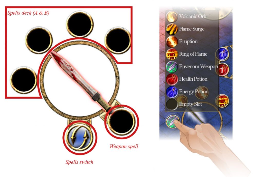
On the right side, near the area of action I placed the other buttons. On the upper part of the action circle, the spells are spread. There are 4 spells constantly present, each spell can be configured directly by holding the touch over a button for two seconds, then a drop down menu containing unlocked spells appears: clicking on a chosen spell allows to customize the button.Under the lower part of the circle action area, there is a switch button. Because of the impressive number of spells available in the game, we didn’t want to limit the deck to just 4 spells. So I created 2 decks of 4 spells (Deck A spell 1 to 4 and Deck B spells 5 to 8). When pressing on the deck switch button, the player can switch from Deck A to Deck B.
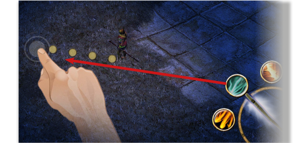
Regarding the spells, we encoutered an issue during the development: some of them target a single ennemy and some target an area. On PC, the user just has to hit the shortcut of the spell, aim with the cursor and cast the spell by left clicking. This kind of design is not an option on a touch screen : if, in order to cast a spell you have to touch the shortcut and then the ennemy or the area, then what would be the options to cancel the action? We came with a different design to cast spells: the user just has to drag the spell from the shortcut and to drop it on the targeted ennemy or area.
To make it easier to aim, we added a doted line as a visual feedback so that the user knows exactly where or what he’s aiming at, and as some fights are pretty intense, we also added a slow mo effect while aiming.
| The last button on the lower part of the circle action area allows you to assign a permanent spell to the current weapon. This allows the player to add a continuous weapon spell rather than a basic attack, this for the cost of some mana points (when the mana bar is empty, it switch to the basic attack) Above the circle action area there are the available potions. We’ve added a default setting to automatically use potions if the life bar falls below a certain level. Those buttons also display the remaining number of potions. | 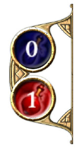 |
On the right of the teleportation portal button is displayed the experience gauge that let the player know if he is near the next level.
Finally, on the right area of the experience gauge, there is the switch weapon button. As in the original game, this button enables to switch from weapon 1 to weapon 2.
Build a new interface using the original elements and styles
To create all these new buttons and elements that didn’t exist in the original version, I was inspired by the existing Titan Quest art direction.
The colors are ocher, sand and stone while the forms used for the interface reminiscent of ancient arabesques. Some icons have also been reworked to be clearer and be in a much better quality such as the weapon switch and teleportation portal buttons.
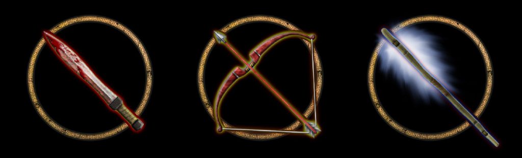
I also created different icons for the action area in order to give the player a visual feedback of the action proposed to him.
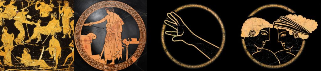
It was therefore necessary to create an icon for each type of weapon used (swords, bows and spells staves) but also for the two kinds of proposed actions: a pick up / interaction icon and a dialogue with NPC’s icon. For these two last actions I was inspired by the art of ancient Greece, in particular human representations on frescoes and bowls. Often black characters with ocher outline.
Adapting screens
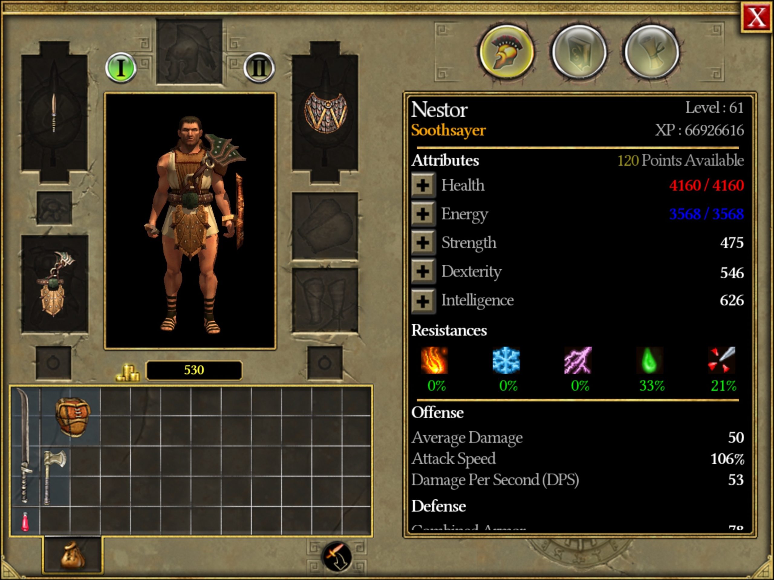
The inventory, masteries and quests screens have also been adapted. In the original version, all of these screens are windowed, the game doesn’t stop when the player display them. For this mobile adaptation, we decided to present these windows in full screen mode and pause the game in the background.
A readjustment of the items was therefore necessary on every screen because we wanted to keep as much information as the original screens. For example, we opted for a drop-down window to display all the player’s statistics which where displayed on two sparated tabs on the original game.
For the management of inventory items, the original version allowed through a simple drag and drop to assign items to the active equipment (set 1 or 2) or throwing them away. Touch screen allow player to assign items the same way. To lay the objects I designed a simple drop box that is used as “trash”.
 |  |
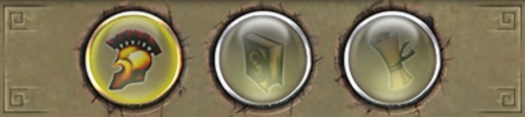
Another innovation on these screens is the ability to switch from one to another without returning to the main screen. So I put directly on these screens 3 icons from the original game’s dock. It’s kind of a very simple menu that is displayed each time on the same place. I redrew these icons as the originals ones but in higher resolution.
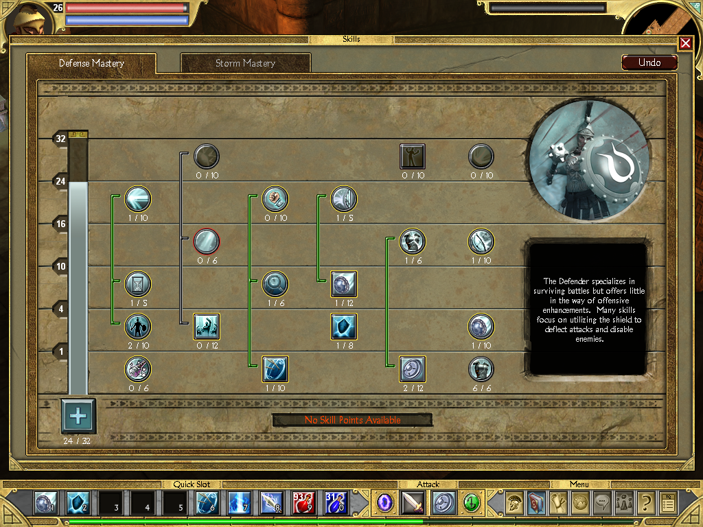
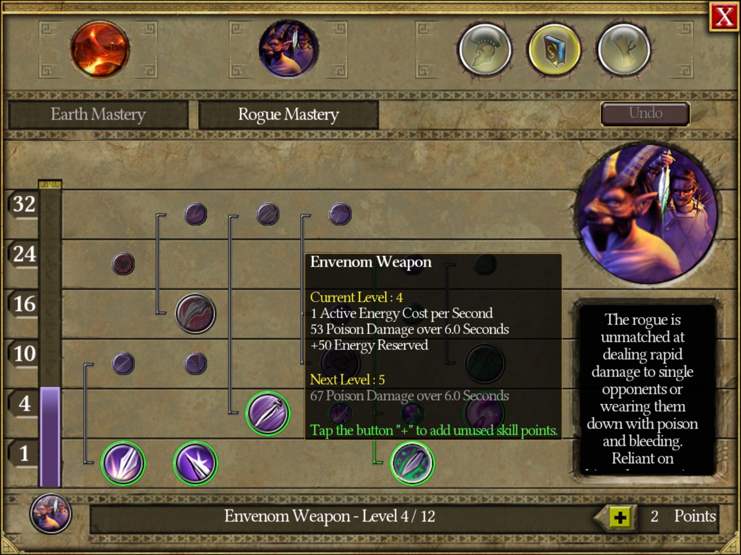
Finally on the masteries management screen, we adapted the point system for touch screen because the original size was too small and difficult to use if we had kept it unchanged. By adding a points distribution module at the bottom of the screen, the player can easily increase the level of the spells he wants to use. All masteries related icons also have been reworked in order to see if they are selected or not.
For the quests screen and the map, a simple readjustment was enough.
 |  |
A new icon
Finally, one of the most important elements when you work on a Appstore or Google Playstore game is the main icon.
At the time of the release of the original PC game, the icons wasn’t so important, it was only displayed on your computer desktop. Today on the dematerialized market, having an easily visible and identifiable icon is crucial, mainly to stand out among the millions of apps and games that abound those virtuals storefronts.
To match with the original icon, I kept the Spartan helmet. After multiple iterations, the final look that I chose use the same logic and stay close to the ancient Greek paintings. The helmet is very stylized, using a black color on a background damaged and cracked bright ocher wall. A slight outline repeating typical geometric patterns from the same historical period highlights the icon.
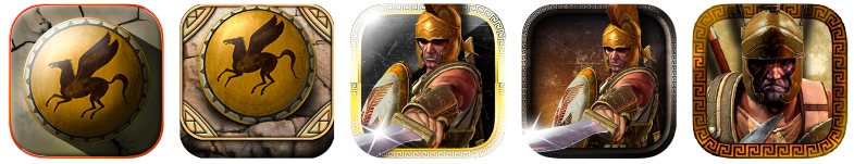
 The original PC icon |
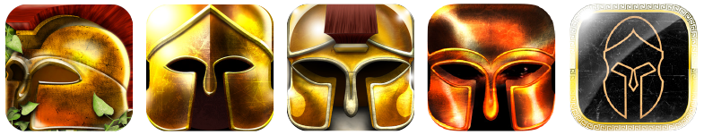 Some variations of the helmet |
 Other ideas… |
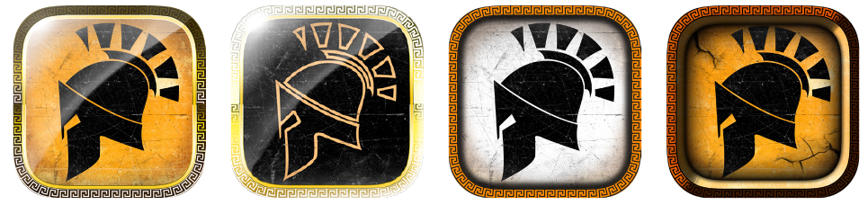 The selected design with variations |
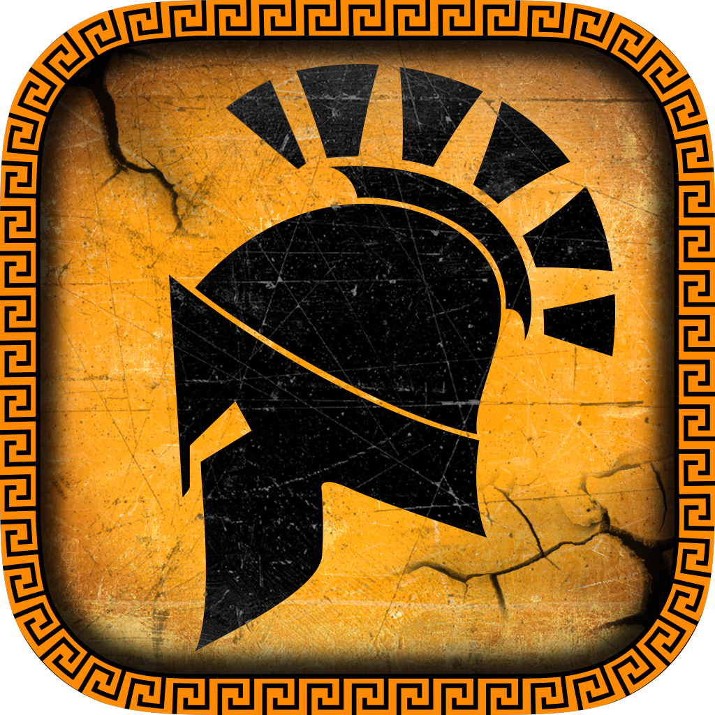 Final result |
Adapting a Hack’n Slash on mobile device is clearly not an easy task, however it’s greatly exciting. To be completely surrounded by an existing art direction surely limits the options in terms of design. But it also helps to push the limits of your creativity much more and provides more precise and substantial results than when you have to start from scratch.
I also realized that multiple subtleties and ideas can be set up to keep an authentic experience when you launch a title as well known as this one on mobile. You have do everything to keep the gameplay as close as it was for players who have known the original version while providing a radically modern experience for new players.
This game has brought us a lot, at Dotemu, in terms of experience. The fundamental design steps to port this title will serve as a solid foundation for the upcoming PC games that we could adapt for mobile devices.